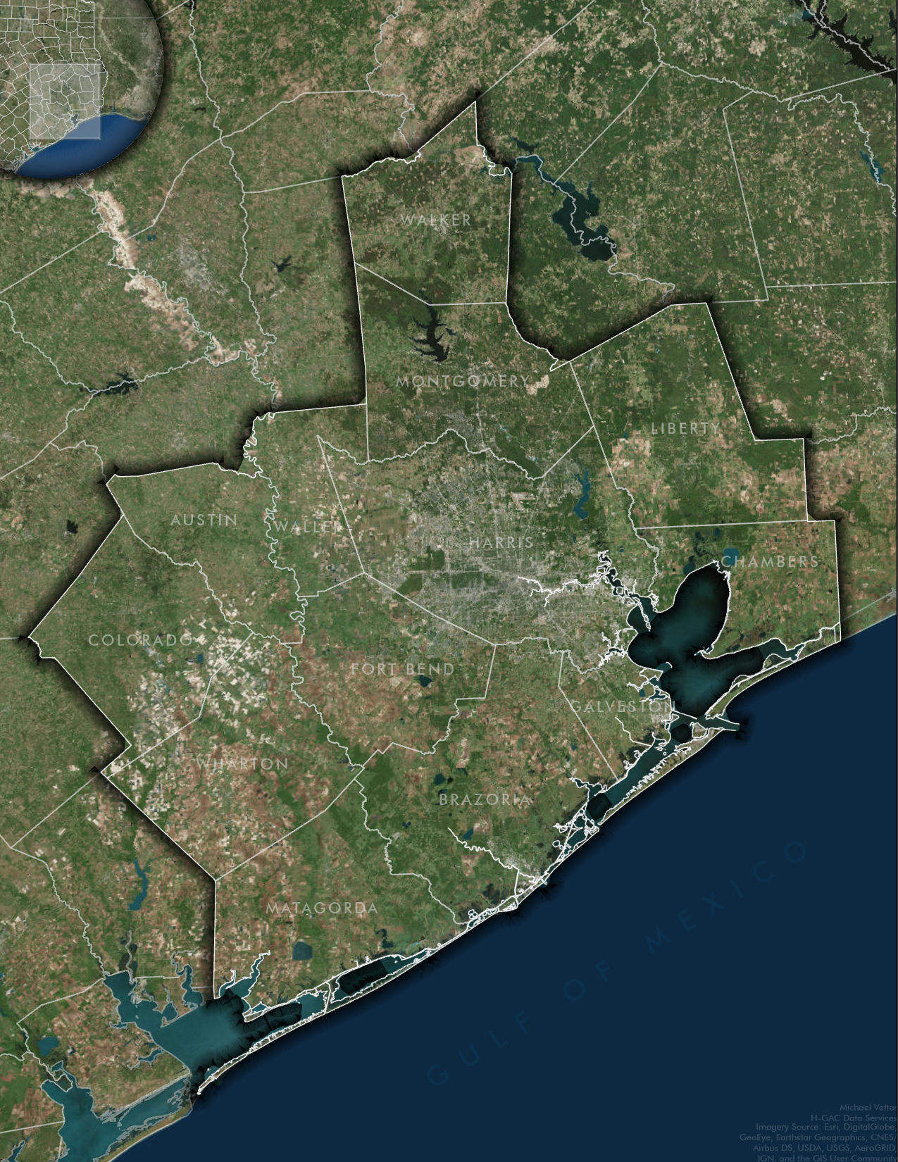
H-GAC Counties
Technology Used: ArcGIS Pro
About: In the conference/meeting rooms, there are many maps that show various items within the H-GAC counties. When view these maps, I always cringe a little because the maps are very gaudy and could be created better. I decided to see if I could create a better H-GAC map.
Process: Since I was going to just show the counties within the H-GAC area, it wasn't difficult to find the data. Once I added in the counties for Texas, I copied the layer and querried to display only the counties that are within the H-GAC area. I wanted to play around with popping out the 13 counties. I decided on using a drop shadow which I think makes the 13 counties really standout from the other counties. Next, I decided to label the 13 counties in a very faint gray so that the labels wouldn't overpower the map. I chose to use imagery to give the map a realistic feeling. I created an inset map in the top left-hand corner to help give the viewer an idea of where these counties are located. I made the inset map rounded so that it doesn't distract the viewer. I added a "glassy" box around the counties. This "glassy" box is the color palette as the county lines which keeps a nice color theme.
