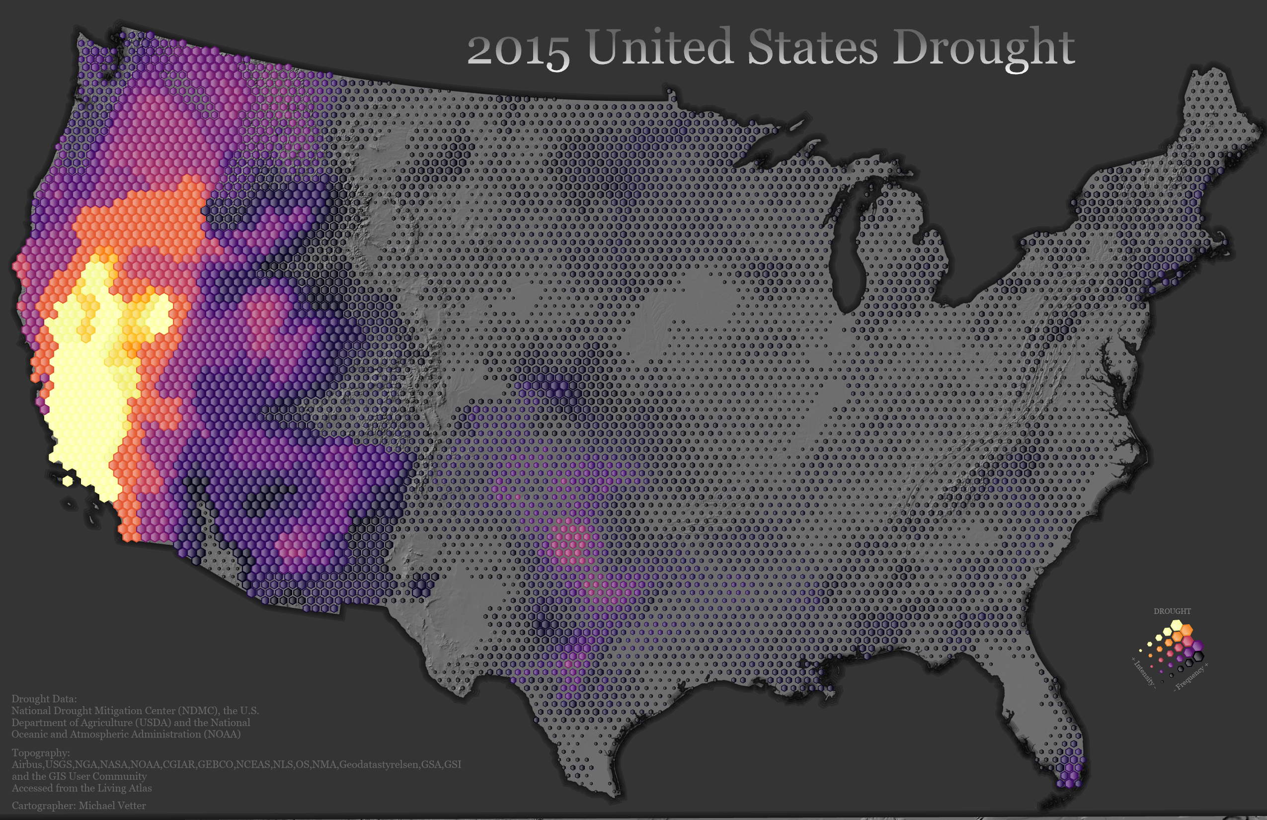
2015 US Drought
Technology Used: ArcGIS Pro
About: This map shows areas of drought in the United States during 2015. The map is based on this blog/tutorial from John Nelson.
Process: There are videos within the blog that shows how the map is created. I decided to use 2015 instead of 2018 so that I would be creating something slightly different then what John created. I downloaded the data from the National Drought Mitigation Center which resulted in 52 different shapefiles. I merged all the shapefiles together to create a single shapefile. Next, I created a transverse hexagonal grid where each hexagon has an area of 1000 square kilometers. I spatially joined the hexagons and the drought shapefile. I added together a field from the drought shapefile called Power so that each individual hexagon will have the sum of Power. I created a bivariate map displaying the frequency of drought and the severeness of the drought. The Power field that was added together was used to display the drought severeness. I added a hillshade layer to display the mountains. I also manually created a legend for this map using the hexagons.
